I was recently standing on the marble floors on the steps of a project when, while looking at the balusters and handrails I was holding, I started thinking about shelter.
I pondered how our needs have evolved from protection from the elements to security from danger, to safe and comfortable spaces. Now, it seems we’re going full cycle to embracing nature again in the hopes of finding wellness in our indoor lives. Since one of the most enjoyable rewards of being an architect is the opportunity to inquire about what our friends are up to, I went around and found 12 houses redefining how we live today.
This is the first of two articles featuring works from some of the most creative minds in our industry. What you will find is that beyond wellness and comfort, our homes can also be places of delight, spaces that allow us to find memorable and worthwhile moments as we go through the day.
There is Jorge Yulo’s investigations of a house with no walls and Ed Calma’s personal explorations of overlapping spaces in a compact form. Buensalido + Architects expresses time and aging while Nazareno + Guerrero romanticizes a flowing creek. There is also BAAD’s horizontal extrusions of a narrow lot and Denise De Castro’s almost sectional composition of planes and junctions. Indeed, it’s quite a collection of homes that make us think and consider the spaces we inhabit and call our homes.
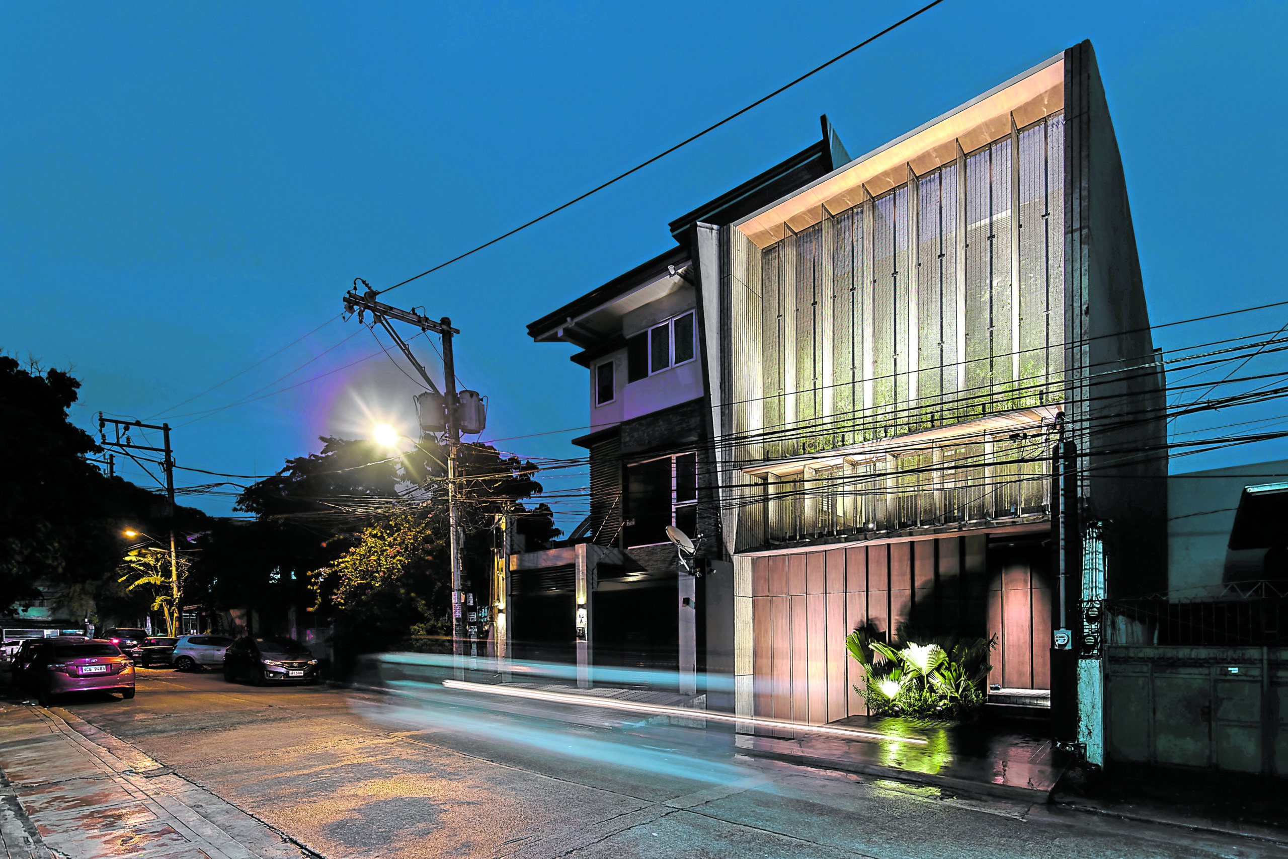
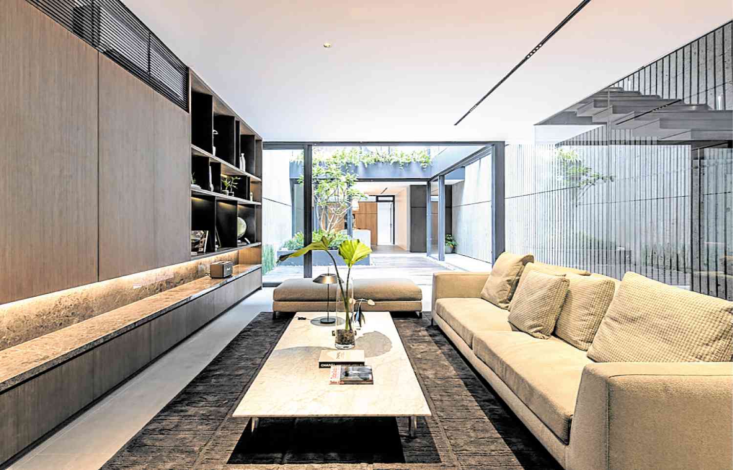
The Narrow House by BAAD
The Narrow House by BAAD Studio augments a narrow facade of less than 7 meters wide, using a stainless steel wire cloth system for maximum airflow exchange and safe security control for the resident. The interior of the ground level looks into the shared interior court to bring in the external elements into the house.
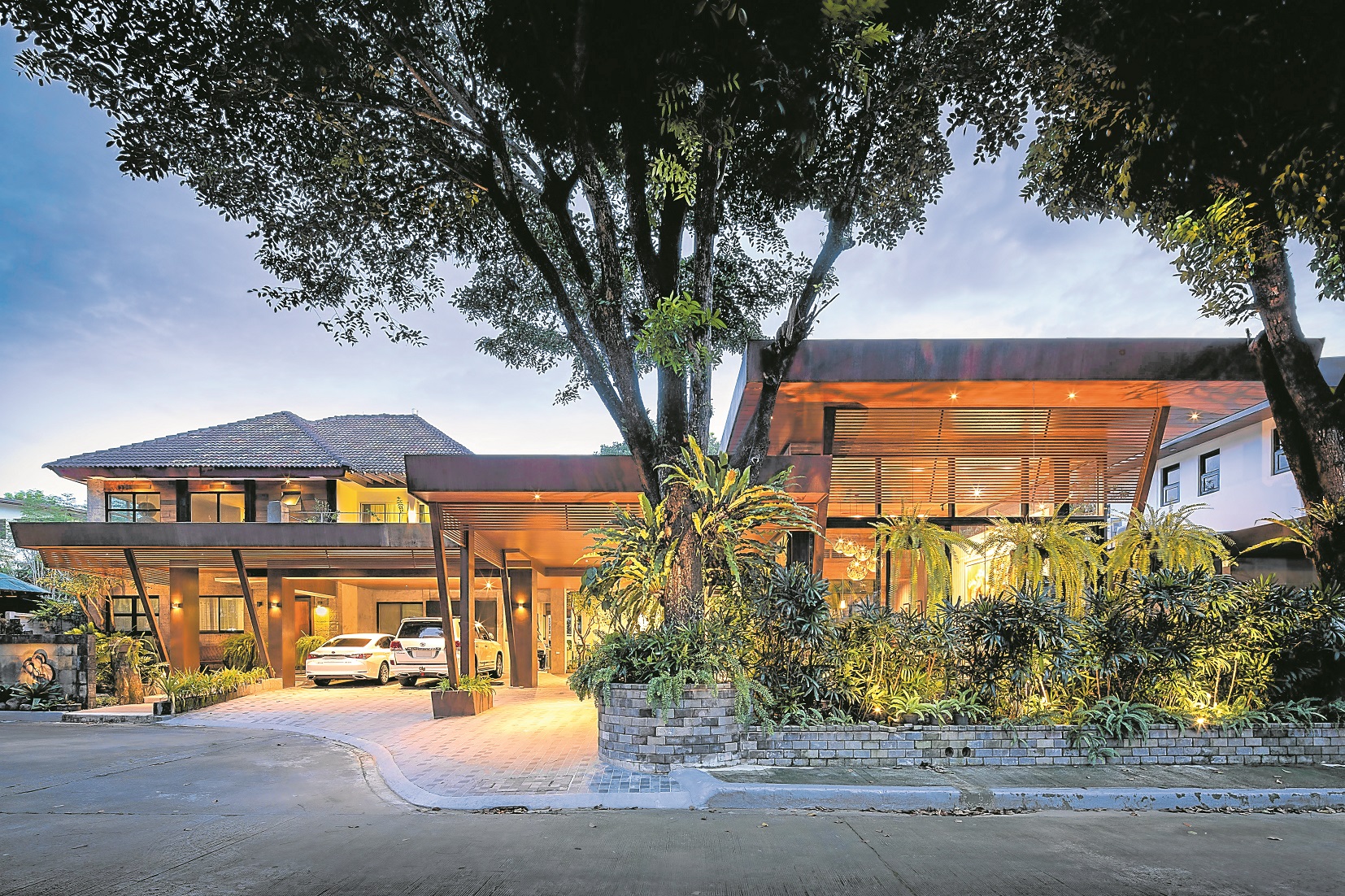
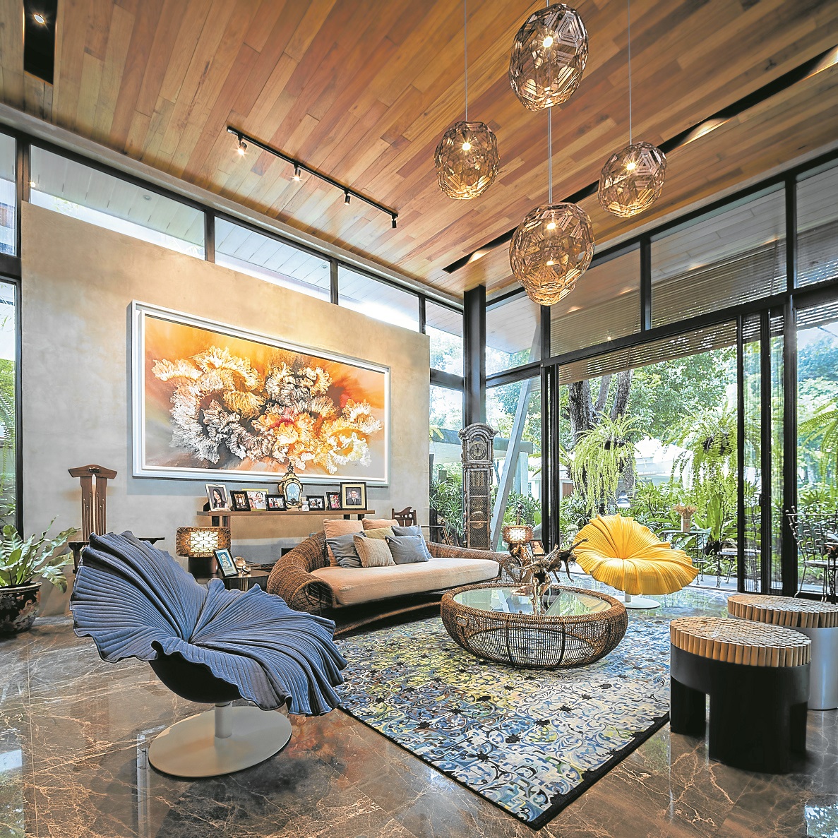
Buensalido+Architects’ Project Patina
Buensalido+Architects’ Project Patina incorporates materials that would change and age gracefully over time. The exterior is defined by simple yet strong horizontal lines clad with corten steel that would develop a distinct patina over time and are supported by V-shaped columns that in turn, also support the wide wood-clad eaves. The house is an expression of living infused with a lush and vibrant environment that invites nature into the home by combining indoor and outdoor spaces.
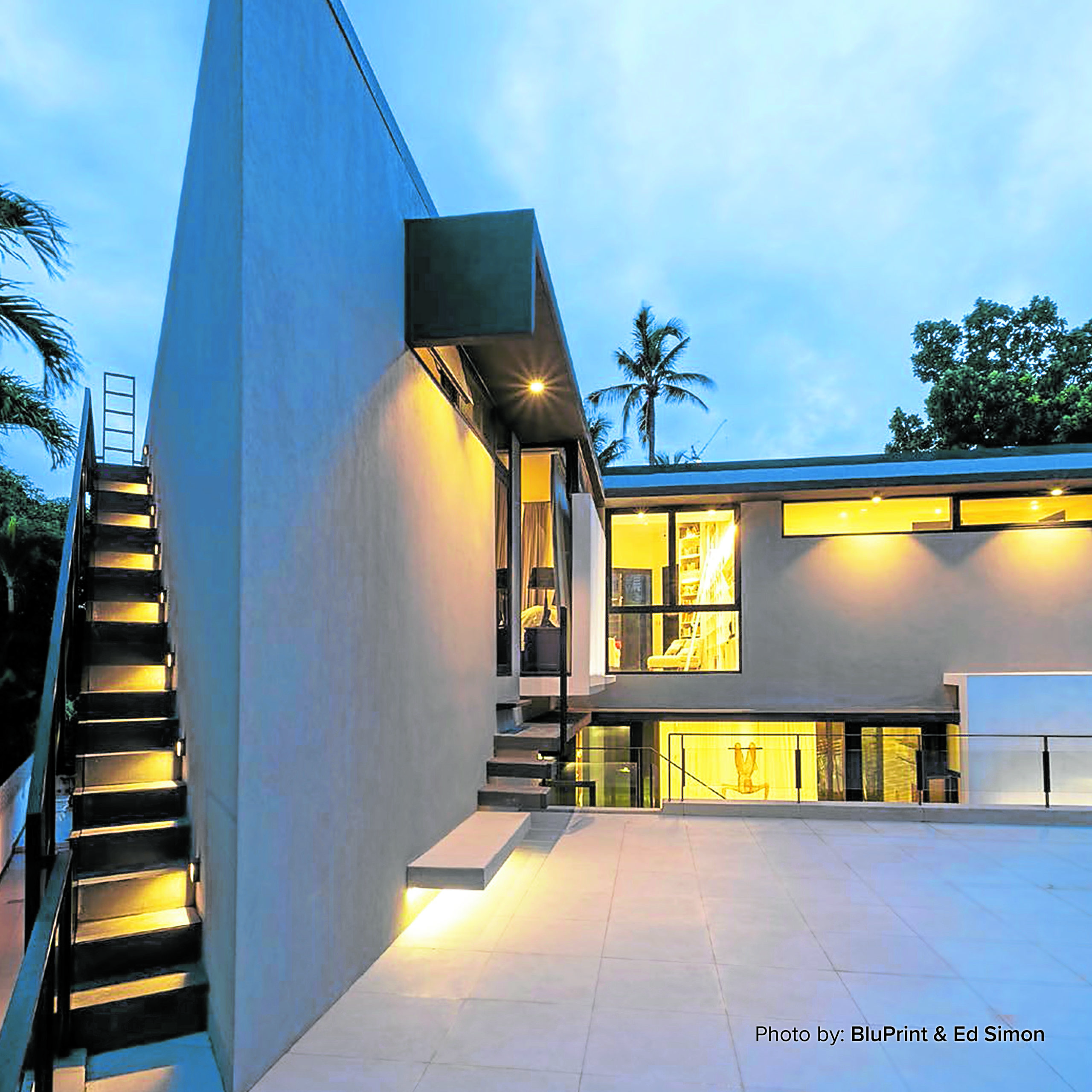

DEQA Design Collaborative’s G Residence
DEQA Design Collaborative’s G Residence prioritizes spaces and circulation that encourage social interaction and engagement between family members and guests. Framing views of the city from the second floor library, the balcony facing the street, and the 360-degree view on the roof deck were design decisions made to emphasize connections with the city. The front façade is rotated diagonally to the street to face due south optimizing the roof’s direction for the installation of solar panels and creating privacy from the bustling street.
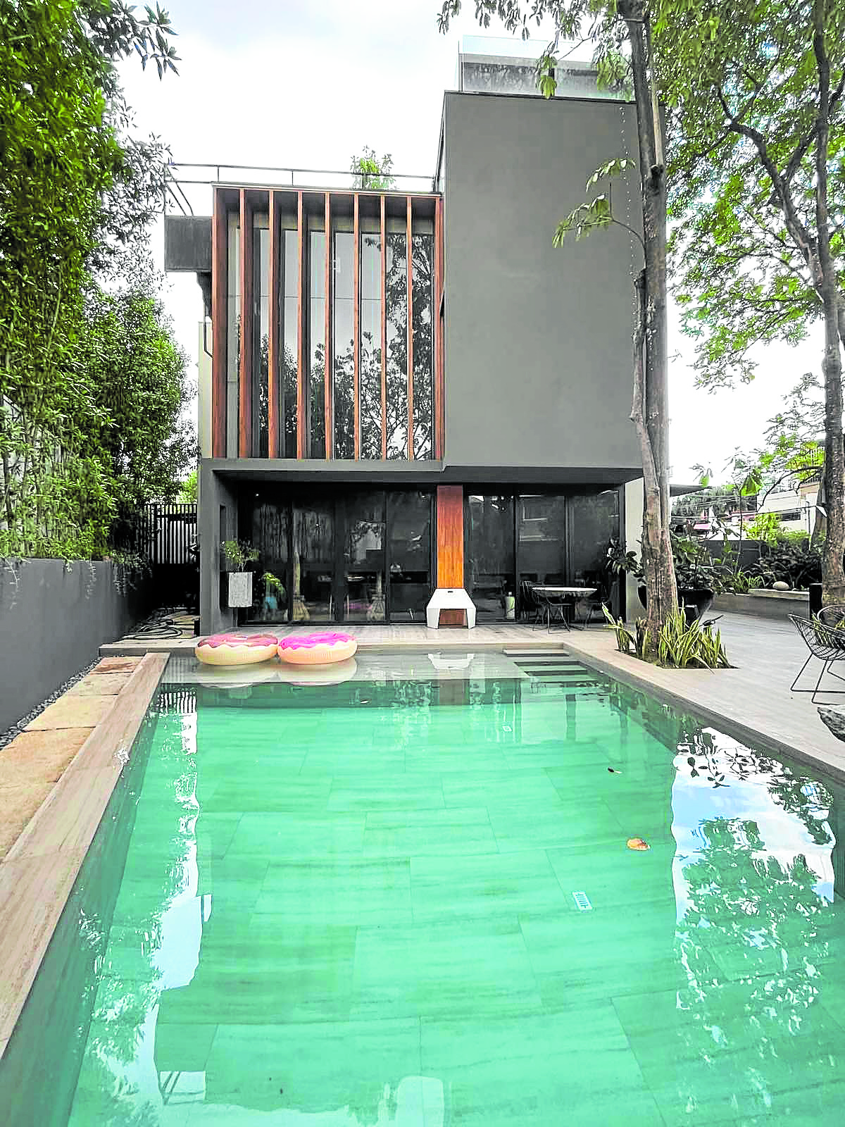
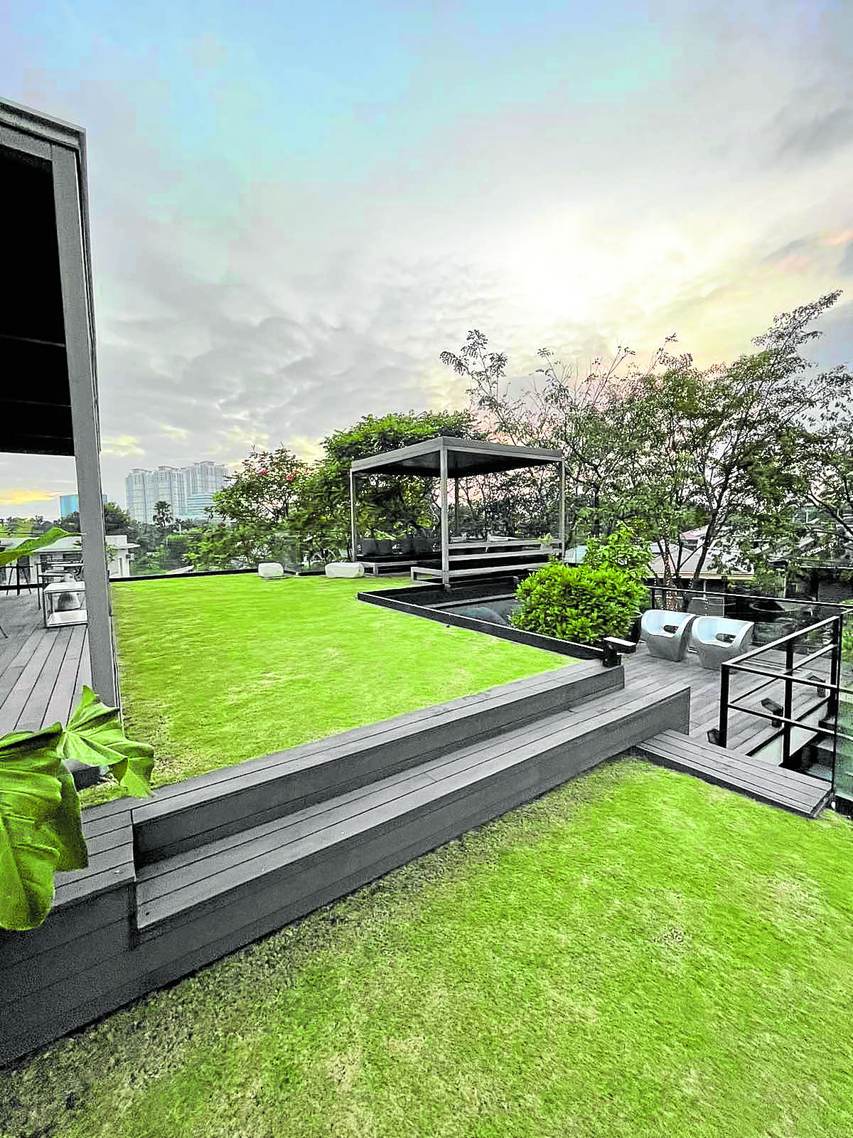
Ed Calma’s Slice House
Ed Calma’s Slice House is a cube that’s been sliced vertically in various widths to express the functions inside to fit into a 388 sqm pie-shaped property. The double height living and family rooms overlap into other floors providing various views, allowing light to overlap and expand the space. The pool, together with the roof garden, allows for an almost total restoration of the natural state.
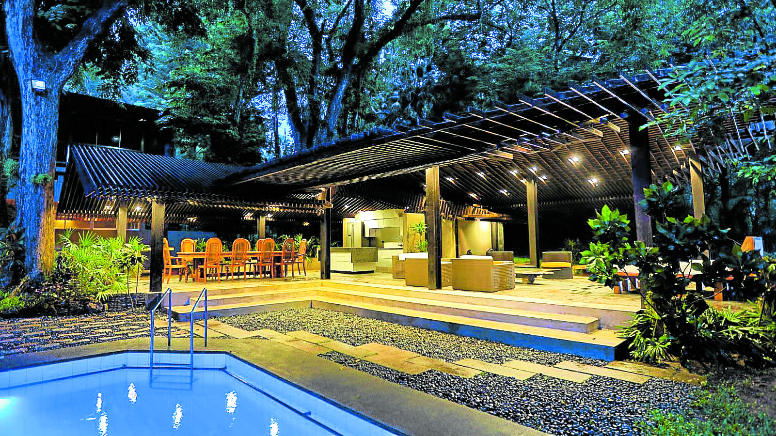
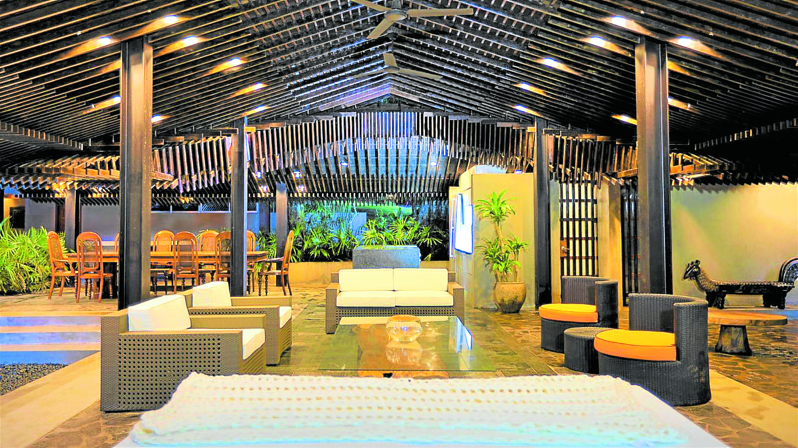
Jorge Yulo’s House
Jorge Yulo’s House with No Walls is a steel cottage that occupies the exact footprint and location of a 50-year-old wooden guesthouse that succumbed to wood rot and termite infestation. It sits on a mature garden between a pond and an old swimming pool that pre-existed the wooden structure. All sides of the structure except the bathroom are without walls, a tropical version of Mies’ Farnsworth house sans the glass. The Venturi effect generated by a roof and no walls will funnel air further cooled by either the pool or pond to go through the cottage—similar to the traditional cooling principles used in Balinese Pavilions or “Bale.” The space is designed to be sheltered and, at the same time, benefit from the outdoors.
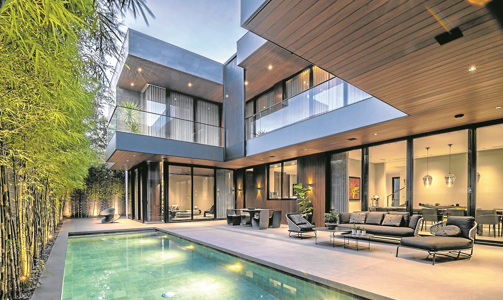

Nazareno + Guerrero’s Creekside Residence
Nazareno + Guerrero’s Creekside Residence is nestled alongside a man-made creek. The environment is highlighted through auditory perception of the creek’s running water, whereas its spatial design created specific sight lines that acted as visual cues between inside and outside. The layout allowed both floors to overlook an abundant outdoor space surrounding the pool. Both sensory play and spatial design represent a tranquil environment where every detail was carefully crafted to allow spaces to complement each other.
#realestateblogph | #realestateblogphsundayfeature | #REBPH | #realestate | #houses | #beautifulhomes
Article and Photo originally posted by Inquirer last January 16, 2021 3:50am and written by William Tii Jr. Minor edits have been made by REBPH to cater to its own readers.




More Stories
Weekend wanderer: This walk in Manila is a trip to art and to our past
Enjoy no-frills camping in the great outdoors in Tanay
Landco Pacific raises the bar for premium resort and leisure living