Did you know that 70 percent of today’s consumers are concerned about being too close to others while shopping for the holidays? As people continue to practice social distancing out of precaution, it is high time to reconfigure your store layout.
Know your sight lines
Check the sight line of your store while you’re still at the front. Shoppers should be able to look into and through the sales floor. Remove tall fixtures close to or at the front that obstruct products stored behind them. Make your exhibits apparent by positioning shorter fixtures near the front of the store and larger fixtures towards the back. Remember that the more a shopper sees, the more likely they will purchase.
Start from the outside
Make a statement with your exterior design and build the excitement of customers from the store. To attract attention, ensure your signage is clean and legible and consider advertising sales on your windows. Or you can also set up a sale table or rack outside your storefront.
Find the best store layout
A store layout is a deliberate arrangement of permanent fixtures within a store that intends to produce a good shopping experience and encourage purchases. It is crucial to first identify the demands and goals of your store layout early in the design process.
A grocery store, for example, might use a layout meant to retain and arrange as many products as possible while facilitating a smooth shopping experience. Meanwhile, a boutique may display fewer curated items to offer a more exploratory buying experience. Other options for store layouts include the grid, loop, free-flow or mixed, diagonal, forced-path, and angular store layouts.
Avoid product placement in the “decompression zone.”
The decompression zone is a 1.5 to 4.5-meter area positioned right inside the front door in every store. Its size usually depends on the store’s floor area. This area should allow customers to shift from whatever they are doing outside of the store to shopping.
Understand that the decompression zone is a “no man’s land” and that anything set there will be ignored by consumers. Floor signage, carts, baskets, product displays, and so on should be placed just beyond the decompression zone, where consumers are more likely to see them.
Have a vertical power wall
When customers first enter a store, where do they go? Regardless of the displays, most people gravitate to the right. This natural behavior presents the ideal opportunity to entice customers with the most spectacular merchandise accessible.
A great idea for maximizing this valuable space is to build a power wall out of vertical shelving. A power wall is an expansive, eye-catching display that can help direct shoppers to your most popular products while minimizing your display footprint.
Strategize your displays
The worst enemy of the retail store design is clutter or having too much merchandise and decor. It obstructs shoppers’ ability to see and physically navigate across your space.
To avoid an overcrowded store, assess the appropriate number of items. Higher-end retailers should display fewer products and leave more unused floor space to raise the merchandise’s perceived worth. On the other hand, big-box or budget retailers should use every square inch of space available, as this will reinforce the notion that buyers are getting a reasonable price and will help them sell more things.
Or use products as décor
Using your items as decor allows stores to display more articles on the floor, attract customers with a visually appealing layout, and reduce the requirement for decorative objects. However, remember to blend visual attractiveness with product capability.
Highlight focal points
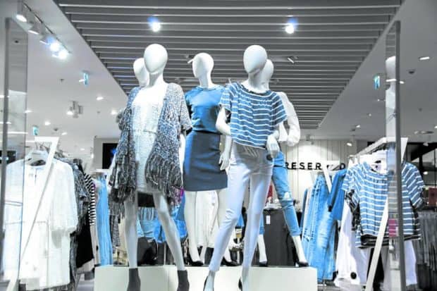
Display pieces in your store that grab the attention and direct clients through your space are known as focal points. Typically, focal points are placed in strategic locations like entrances, high-traffic areas, centrally, or within window displays. A cluster of mannequins, a POP display, or simply a table laden with merchandise can serve as focal points, but they are required to make a visually exciting store and to engage customers.
Have wayfinding and desire paths meet halfway
Have you ever avoided the sidewalk in favor of cutting across the grass to get somewhere faster? You developed the desired route and have them on your sales floor. Examine your flooring for excessive wear in specific locations or observe how consumers buy in the business. Once you’ve determined which shortcuts they favor, position displays precisely in the center of that location.
Let your customers sit
It would help if you strived to make your environment comfortable for both consumers and guests and make it shoppable. Adding chairs to your store will give customers a place to rest and may even encourage them to stay longer.
Use smart lighting
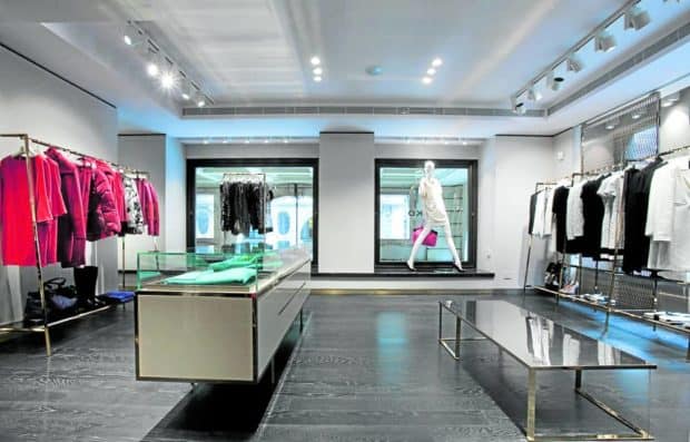
A retail store’s lighting increases visibility and draws attention to specific products or regions. It also aids in creating an atmosphere. Adequate and intelligent lighting will make the remainder of your store design apparent to customers and serve as a backdrop for everything else in your store.
Curate areas for “photo-ops”
Modern consumers, particularly younger ones, will take tremendous measures to “do it for the gram.” As a result, setting up photo possibilities at your place is one approach to attract them. Make an Instagram wall or designate a nook or section in your store for these customers.
Shopping experience
Developing an appealing, on-brand, and engaging retail shop design is critical when starting a retail business. You want to make sure it creates an excellent user experience, increases revenue, and strengthens your brand. Following these ideas will get you started on creating a functional and visually appealing store design that will help any business thrive.
The author (www.ianfulgar.com) is one of the premium architects in the Philippines who assists local and international clients in enhancing hotels, condominiums, museums, and commercial and mixed-use township developments with distinctive and forward-thinking design specialties for the real estate industry
If you like this article, share it on social media by clicking any of the icons below.
Or in case you haven’t subscribed yet to our newsletter, please click SUBSCRIBE so you won’t miss the daily real estate news updates delivered right to your Inbox.
The article was originally published in Inquirer.NET and written by Ar. John Ian Lee Fulgar.





More Stories
Vista Land Celebrates 50 Years with Sandiwa: An Event Honoring Leadership, Legacy, and the Filipino Dream of Homeownership
Vista Land Celebrates Love Month in Ilocos Region
Vista Land Bridges Cebuano Heritage and Progress with Valencia by Vista Estates